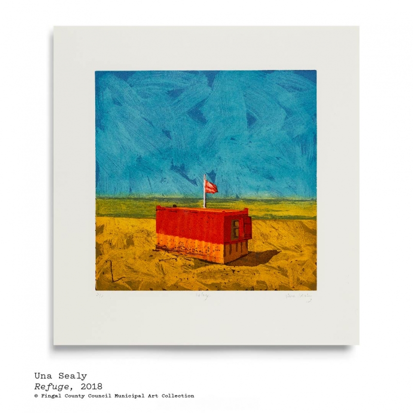
Fingal Municipal Art Collection - Una Sealy, Refuge.
Artwork: Una Sealy’s, Refuge, etching.
In discussing Una Sealy’s etching, Refuge, it might be helpful to start by describing what we see in this abstracted beach scene. Sealy tells us that this is Burrow beach in Sutton – a place she’s known and enjoyed all her life. The image is divided by a horizon line that separates the picture plane into thirds. This is a classical way of composing an image, as it is believed to be ‘harmonious.’ Sealy has placed an image of a rectangular hut turned at an angle – with one corner pointing at the viewer so we can see both its long side and its short side and a small, open window. There is a flag atop the container, lifted by a soft sea breeze. Its red colour tells us the lifeguards are on duty and it is safe to swim. The blue sky is cloudless and we have the beach to ourselves.
Looking at the colours Sealy has used, can we notice her use of complementaries – those combinations that make each other brightest? The sand is depicted as more orange than its usual beige which hums with the cobalt blue sky and the red strip of the hut and flag hover next to a single band of bright green which depicts the sea. How does she suggest heat in her choices of colour and where the hut’s shadow is placed? This is a popular swimming spot and we can see it’s a perfect day for a visit, so why might Sealy have chosen to depict the scene without any people in it?
The title, Refuge, and central placement of the hut shows Sealy’s main focus. With all the time we have spent in our own ‘refuges’ these days, what ideas of safety might the image offer? Looking at the way Sealy used zig-zagging brush-marks in the sky and sand – how does this add to the piece? Does it help the image to feel busy or energetic, even without people or might the marks have other associations for you? Does the hut remind you of a toy perhaps? Can we see how Sealy has used the etching process to show elements of texture on the hut and the sand near it? How might the piece read if she hadn’t used texture? What can we gather about the state of mind the artist is depicting in this image?
Activity| Here’s an idea inspired by Sealy’s image, for you to try at home.
Monoprint exercise| Materials needed: Plastic pocket. Any paint.
Mono-printing land or seascape. A monoprint is a one-off print, as opposed to an etching like Sealy’s which would be one of a series of repeated images. Sealy’s etching was made by scratching into a copper plate and she has used aquatint to get brushwork effects.
To try a simple monoprint process at home: use a piece of flat plastic – a document pocket works well, but you can also wrap cling film (tightly) on a cutting board or card. Using any type of paint or even diluted food colouring, paint loose brushwork on the plastic. You might consider dividing the image into thirds like Sealy did. This will immediately suggest land or seascape. You might use complementary colour combinations – blues with oranges; greens with reds; purple with yellows. Cover the plastic sheet in your brushwork and then quickly place a sheet of paper face down on your plastic and rub the back of the sheet with your hand (not too firmly or you might flatten your brushwork). Then peel off the paper to reveal your monoprint.
If you want to add more detail, you could do another monoprint with shapes/lines/textures on top, but let the first one dry before layering. Or use your brushwork print as a drawing base with charcoal, ink or pencil to add details. Might you think of other refuges? A treehouse? A fishing hut? A garden shed? The garage, a tent in a forest or any space that feels like a safe-haven?